Strategy, creative and execution, all in house.

See pricing →

Every channel, one team, weekly results.

See pricing →

Work that ships weekly and looks like you.

See pricing →

Every channel, one team, weekly results.

See pricing →

Different buildings. Same obsession with leases.

See pricing →

Different buildings. Same obsession with leases.

Pricing and packages →

Different products. Same obsession with pipeline.

All SaaS and technology work →

Different trades. Same obsession with booked jobs.

All home services work →

Different practices. Same obsession with signed clients.

All professional services work →
Thank you! Your submission has been received!
Oops! Something went wrong while submitting the form.

Renderings

Photorealistic rendering, and why too perfect gives it away

What photorealistic rendering is, the cues that make a building image believable, how to review a draft without software and when photoreal is the wrong choice.

Photorealistic rendering, and why too perfect gives it away

In this post

  1. toc

The restaurant owner has driven out to the redevelopment site at four in the afternoon, as asked. The leasing broker hands her the brochure, and she holds the patio rendering up against the empty corner it's meant to show.

She looks at it for a while, then at the sky. In the rendering the patio is bathed in late sun. In front of her, the building next door has already put the whole corner in shade.

The image was a beautiful photorealistic rendering, the kind that could pass for a photo in a magazine. It was also wrong about the one thing a restaurant tenant checks before anything else, and the sun doesn't take direction from the marketing team.

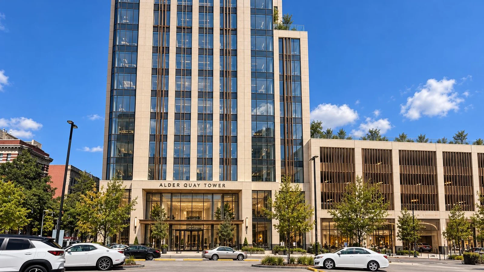
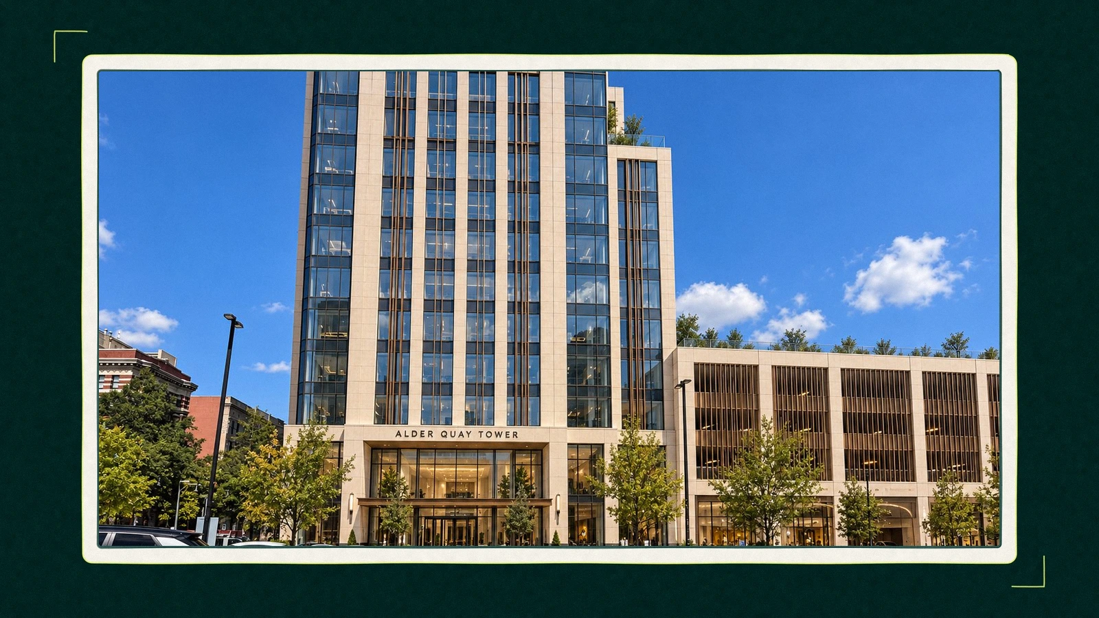
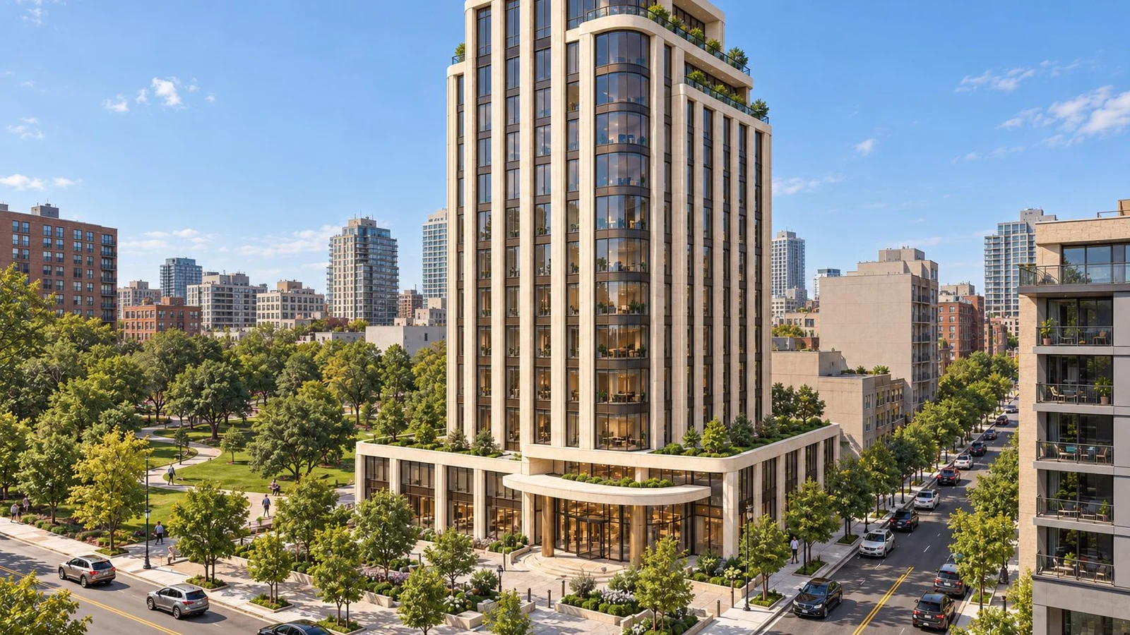
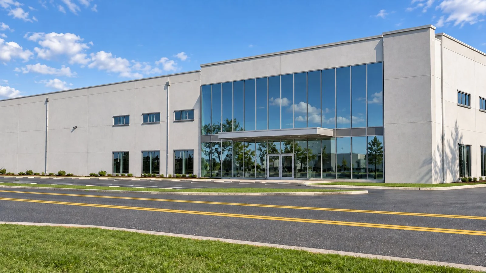
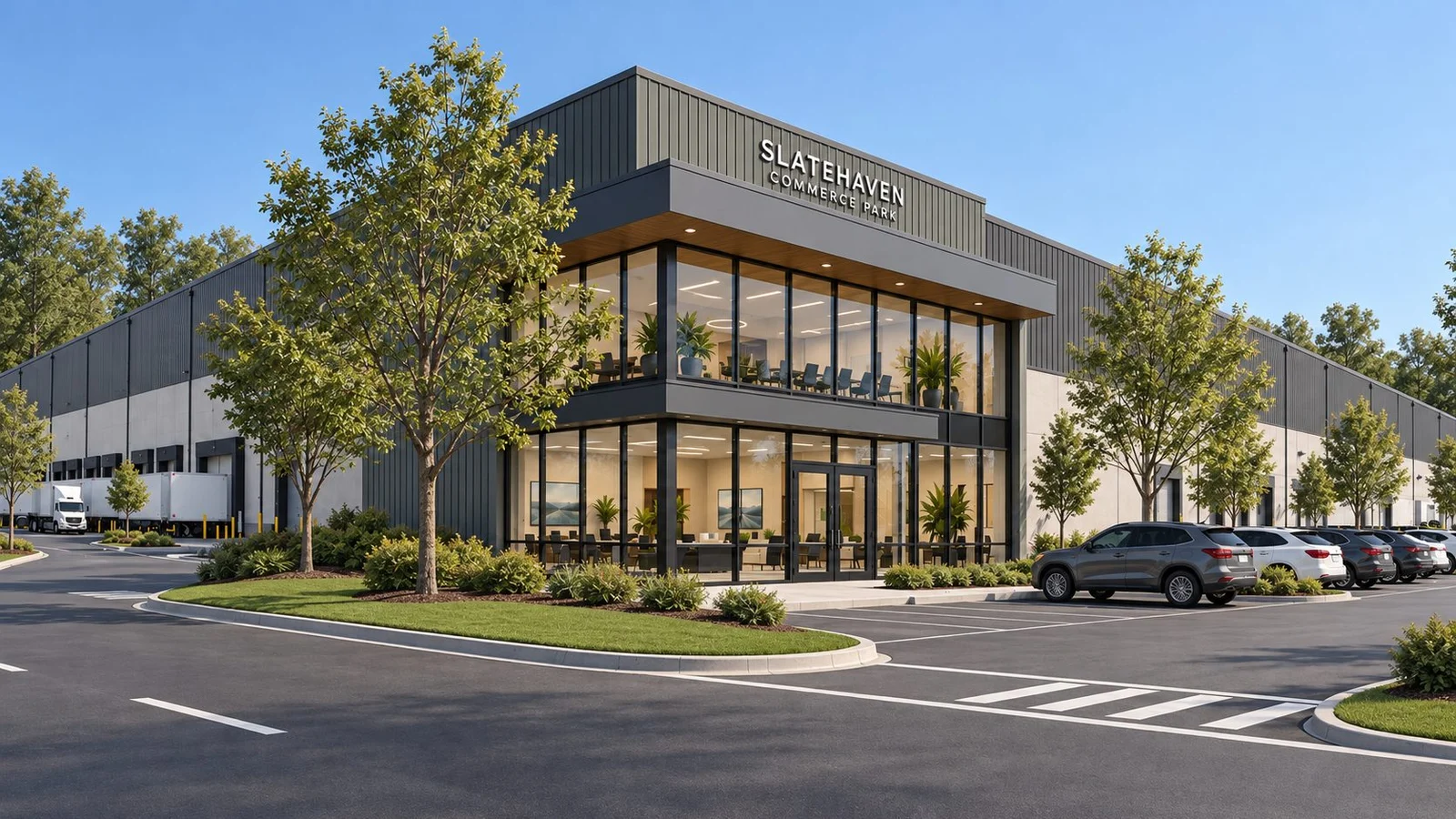
Photorealistic rendering of a stone and glass office tower behind a parking lot with parked cars, young trees and a blue sky with clouds

What is photorealistic rendering?

Photorealistic rendering is a computer image of a building, made from its 3D model, that is hard to tell apart from a photograph. Light, materials, shadows, people and weather all behave as they would on site. In commercial real estate it's used to lease, sell and finance buildings before they're finished.

For a buyer there's a second test that matters more than whether it fools the eye. Would a tenant who signed off this image feel misled when they tour the finished building? If the answer could be yes, the image is realistic and still not fit for marketing.

In property, a photorealistic rendering earns its cost wherever someone decides from the image alone. That covers the leasing brochure, the offering memorandum cover, listing sites, the fence wrap along the road and the investor deck that goes to people who may never walk the site.

The craft behind it has moved fast. Software now calculates how light bounces between surfaces, materials are built from scanned samples, and a good studio can make glass, brick and wet pavement behave the way they do outdoors.

What makes a realistic architectural rendering pass for a photo?

Most tutorials answer this for artists. A buyer needs to know the same cues well enough to spot which one is missing when a draft feels off.

Realism cueWhat it looks like when it's rightWhat goes wrong when it's missing
LightOne believable sun position, soft bounce light in the shadows, warm interiors at duskFlat, even light from nowhere, or shadows pointing two ways
MaterialsBrick with slight colour variation, glass that reflects the actual street, concrete with jointsPlastic looking surfaces and glass that reflects a generic sky
EntouragePeople, cars and planting that match the tenant, the market and the seasonStock figures from a different building type and identical trees
Weather and timeA sky and season that fit the city, with light that matches the hourPalm trees in Minneapolis and a blue sky with no clouds at all
ImperfectionWet asphalt, a crooked blind, a car parked slightly off its lineA building so clean it reads as a model in a showroom

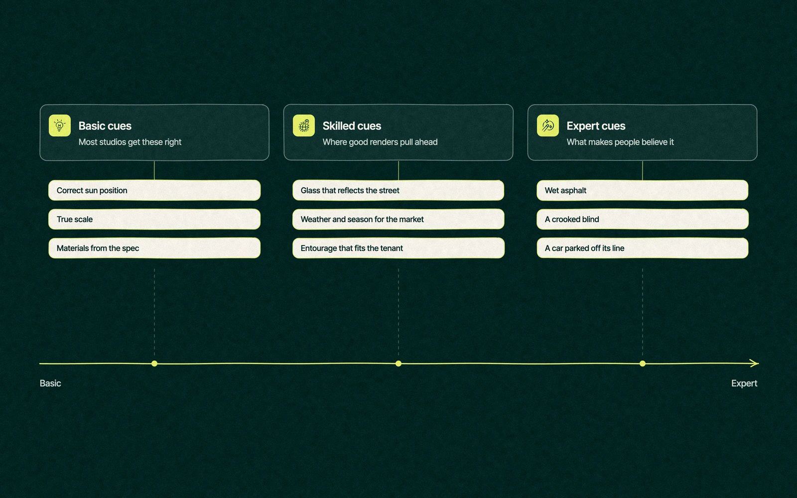
Light and materials are the basics, and most studios get them right. Entourage and imperfection separate a good render from one that people believe on first glance.

Realistic architectural rendering cues in three columns, from sun position, scale and materials to reflections, weather and people, to wet asphalt, uneven blinds and imperfect parking

You don't need software to review a draft. Send comments like these, and any competent studio will know what to change.

  1. Check the sun against the site. The building's orientation sets where the light falls at each hour. A free tool like the NOAA solar calculator shows the sun's position for any address and date.
  2. Look at the glass. Reflections should show what's across the street, not a generic city.
  3. Hold the materials against the spec. If the drawings call for a gray metal panel, a warm bronze panel in the render is a promise you'll have to explain later.
  4. Measure people against doors. Figures should be about the height of a door handle times two, and cars should fit the parking stalls.
  5. Read the signs. Tenant signage, wayfinding and the address should be legible and spelled the way the building will spell them.
  6. Find one thing that's slightly messy. If you can't, ask for it.

Trade You.

Your email for great content delivered to your inbox. Regularly. Unless we forget. Or get busy. But we'll try.

Thank you! Your submission has been received!
Oops! Something went wrong while submitting the form.

How accurate are architectural renderings?

A render can be realistic without being accurate, and that's the combination that costs money. Realism is about how the image looks. Accuracy is about whether the building in the image matches the building in the drawings.

Marketing rules care about accuracy. The FTC's truth in advertising guidance says ads must be truthful and not misleading, and the 2026 NAR Code of Ethics asks Realtors to present a true picture in their advertising under Article 12.

In practice that means heights, floor counts, setbacks, materials and views should come straight from the drawings. Label renderings as artist's impressions, note the date of the design they show and update them when value engineering changes the facade.

The most accurate option for an existing site is a photomontage. The studio flies a drone or shoots from street level, then places the rendered building into that photograph with the camera matched to the lens and height. The neighbours, the trees and the shadows are the ones that exist, so the only invented thing in the frame is the building.

The same approach answers a question office and multifamily tenants ask often, which is what they'll see from a specific floor. A drone photo taken at that height, with the rendered window frame around it, beats a guess at the skyline.

A rendering of a patio in full sun that will sit in shade most afternoons is the kind of small inaccuracy a tenant remembers at the lease signing. A photorealistic rendering makes the error more convincing, which is why the most realistic images need the strictest checks.

Too perfect is the giveaway in photoreal renders

The fastest way to spot a render is to look for what a camera would rarely miss. In most stock renders every tree is the same height, and every office worker is 28, carrying a latte and walking somewhere important.

Finished buildings get used. Delivery vans double park, a blind hangs at a slight angle on the third floor, puddles collect at the curb and somebody's bike leans against the wrong post. Photographers spend hours waiting for a clean frame, and good render artists add a little of that mess back on purpose.

The aim is an image that looks like an ordinary afternoon at a building that's already open. Buyers trust that version because it matches what they'd see if they drove past.

  • Parking lots need a mix of cars, a few spaces empty and one vehicle parked badly.
  • Glass should show a little of the interior, with lights on in some offices and blinds at different heights.
  • Planting should look like it was installed this year, which means smaller trees than the architect's dream.
  • People should match the tenant, with warehouse staff at a dock and families at a grocery entrance, in clothes that fit the season.
  • Weather can be overcast, damp or late in the day, which often reads as more believable than a cloudless noon.

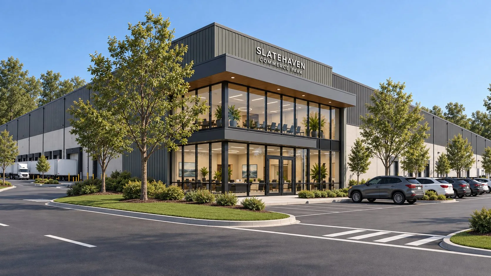
Dusk deserves its own warning. It's the default hero shot because glowing windows flatter almost any facade, but a dusk image with every office lit and empty reads as a stage set. Light a share of the windows, leave a few dark and put one person at a desk who's clearly staying late.

A parking lot where every car is freshly washed is a lot that hasn't seen a Monday morning. A little ordinary disorder makes a photorealistic rendering believable faster than any increase in resolution.

The photo realistic architectural rendering a tenant mistook for a photo

Imagine a developer launching a small office building on a suburban corridor. The studio renders the hero exterior on an overcast day, with damp pavement, a few cars that don't match and a cyclist waiting at the crosswalk.

A prospective tenant's office manager sees it in an email and calls to ask when the building opened, because she wants to stop by and look. The broker explains that it hasn't been built yet, and she asks for the brochure anyway.

The studio didn't add anything expensive to get there. It chose a season the market recognises, kept the trees at the size the planting plan specifies for opening day and let the light be gray, which is what that corridor looks like for much of the year.

That kind of mix up is the best compliment a render can get, and it carries a responsibility. The image now sets expectations as firmly as a photo would, so the studio checks that the parking count, the entry canopy and the glass colour match the current drawings before the brochure goes to print.

The same broker's previous building had a set rendered at perfect noon with spotless cars. Prospects liked it and didn't mistake it for anything but a render, which is the less useful kind of compliment.

Photorealistic architectural visualisation vs stylized, when each wins

Photoreal isn't automatically the right choice. Early in a project, when the design is still moving, a very convincing image can make a planning board or a community meeting think every decision is final.

Stage or audienceBetter styleWhy
Early pitch to an investorStylized or white modelShows massing and location without committing to finishes
Community meeting before design is fixedStylized or sketchInvites feedback instead of suspicion that it's already decided
Planning board approvalPhotoreal, from public viewpointsBoards want to see height and fit as neighbours will
Leasing brochure and offering memorandumPhotorealTenants and buyers judge quality from the image
Fence wrap and site signagePhotoreal at print resolutionThe largest the image will ever be shown, in front of the site itself

A sensible plan for most commercial projects is to switch styles once, at the point where materials are approved. Before it, the images invite opinions. After it, they make promises, and the photoreal set should only start when the promises are ones the budget can keep.

AI image tools sit at the stylized end for now. They're quick for mood and options but don't hold a design to its drawings, which is covered in our post on AI architectural rendering. For the wider set of stills, films and tours, read what architectural visualization includes.

Photoreal rendering services built for the fence wrap

We make commercial real estate renderings from your drawings and check them against the current spec before they go into marketing. We render every image large enough for a construction fence or a lobby wall, which is where an unconvincing render gets found out.

A six view campaign set is $5,500 and a twelve view flagship set is $10,000. When you compare photorealistic rendering services, ask each studio how they check accuracy, how many revision rounds are included and whether finals come print ready at full size.

Because the senior team does the work, the person who chose the overcast sky is the person you talk to about it. The same team then puts those images on the fence wraps and site signage, the brochure and the website.

For the basics of how renderings are made and used, start with our guide to architectural rendering. For office projects in particular, see our post on office building rendering.

Send us a site photo with the plans. We'll render the building into that exact light. Request a photoreal set for your next project.

“

The first call felt like talking to someone who already understood our business. We didn’t have to explain the basics. They showed up with questions that mattered.

James L.

Director of Growth, HR tech

Client

FAQ

Frequently asked questions

What is photorealistic rendering?

+

Photorealistic rendering produces a computer image of a building, created from its 3D model, that looks like a photograph. Light, shadows, materials, people and weather behave as they would on site. Developers, owners and brokers use these images to lease, sell and finance buildings before construction ends, so they should match the drawings as closely as they match reality.

How do you make a rendering look realistic?

+

Start with light that matches the site's orientation and time of day, then materials based on the actual spec. Add people, cars and planting that fit the tenant and season, and include small imperfections such as damp pavement or uneven blinds. Spotless surfaces and identical trees are the most common giveaways, so ask the studio to add some ordinary disorder.

Are photoreal renderings accurate?

+

Accuracy depends on how closely the model follows the drawings, not on how realistic the image looks. A good studio pulls heights, floor counts, setbacks and materials from the current design and updates images when the spec changes. Leapyn checks renderings against the latest drawings before they go into brochures, websites or signage, and labels them as artist's impressions.

Can a rendering be mistaken for a photo?

+

Good renderings regularly are, especially when they show overcast skies, damp pavement and everyday disorder instead of perfect noon light. That's a compliment, but it raises the bar for accuracy, because people treat the image like a photo. Label renderings clearly in marketing, keep them faithful to the plans and replace them with photography once the building is finished.

Is photoreal always the best choice for marketing?

+

Stylized images often work better early on, when the design is still changing or when a community meeting needs to give feedback. Photoreal suits leasing brochures, offering memorandums, planning board views and signage, where people judge quality from the image. Many projects use both, starting stylized and moving to photoreal once materials and layout are approved.

Leapyn frog mark for the Leapyn team, authors of the B2B marketing blog

Written by

The Leapyn team

Senior marketers who run strategy, creative and demand gen for B2B companies. We write about what’s working for our clients right now.

More from this author →

If you like us here, you'll love us on LinkedIn.

Stay updated

Keep reading

Related articles