Strategy, creative and execution, all in house.

See pricing →

Every channel, one team, weekly results.

See pricing →

Work that ships weekly and looks like you.

See pricing →

Every channel, one team, weekly results.

See pricing →

Different buildings. Same obsession with leases.

See pricing →

Different buildings. Same obsession with leases.

Pricing and packages →

Different products. Same obsession with pipeline.

All SaaS and technology work →

Different trades. Same obsession with booked jobs.

All home services work →

Different practices. Same obsession with signed clients.

All professional services work →
Thank you! Your submission has been received!
Oops! Something went wrong while submitting the form.

Website development

HR software website design that turns a visit into a demo

How to design an HR software website that the HR champion, the finance skeptic and the IT reviewer can each say yes to.

HR software website design that turns a visit into a demo

In this post

  1. toc

The sales engineer at a benefits administration platform is early for the final meeting, so she waits in the prospect's lobby. The HR director comes down to warn her about the two people upstairs.

The CFO went to the website last week, looked for a price and found a button that said Talk to sales. The IT lead found the security page, which was one paragraph and a stock photo of a padlock.

Neither of those is a sales problem, and both will come up in the next hour. This is HR software website design seen from the buyer's side, a site built for the HR champion and read just as closely by two people looking for a reason to wait.

HR software website design for three buyers, the HR champion, the finance reviewer and the IT security reviewer

What makes good HR software website design?

Good HR software website design gives each person on the buying committee the page they came for. The HR leader needs proof the product fits their team, finance needs a price or at least a starting point, and IT needs security and integration detail. Then the demo form has to be short enough that visitors finish it.

Looks matter less than most redesign briefs assume. No buyer has ever booked a demo because the hero illustration had more people high-fiving.

Three visitors, one buying committee

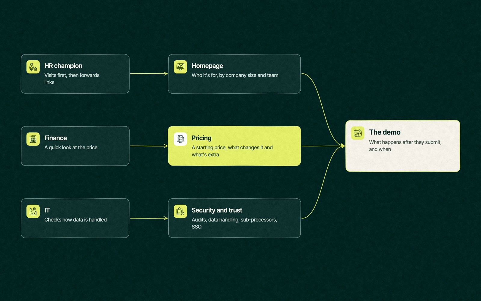
A website for HR software is read by a committee that rarely meets on your site at the same time. The champion visits first, then forwards links to the people who can slow the deal down.

That committee reads fast and forwards faster, so each page has to answer its reader's question in the first screen. A CFO who reads past three sections of benefits copy to find a number has already formed an opinion about your invoices.

HR tech website flow routing the HR champion, finance and IT reviewers to the homepage, pricing and security pages before the demo
PageMain visitorWhat they need to seeCommon miss
HomepageHR championWho it's for, by company size and team, in one lineA headline that fits every HR product on the market
PricingFinanceA starting price, what changes it and what's extraOne button that says Contact us
Security and trustITAudits, data handling, sub-processors, SSOA paragraph and a padlock photo
IntegrationsIT and HR operationsThe payroll, ERP and identity tools it connects to, and howA wall of logos with no detail behind them
Customer storiesThe executive sponsorA company like theirs, a named result, a dateQuotes from "HR Manager, Mid-Size Company"
Demo pageEveryoneWhat happens after they submit, and whenA long form with no promise attached

The best HR software websites treat that table as the site map. Each row is a page with one reader in mind, and the reader can tell.

What pages does an HR tech website need?

Seven pages carry most of the weight on an HR tech website. Everything else is a nice extra or a blog post.

  1. Homepage. One line on who it's for, one line on what it replaces and proof within the first screen.
  2. Product pages by job to be done. Payroll, onboarding or scheduling, each written for the person who does that work.
  3. Pricing. Covered below, since it's the page finance forwards to the CFO.
  4. Security and trust. The page IT reads like a contract.
  5. Integrations. Each major connection gets a line on what syncs and how often.
  6. Customer stories. Grouped by company size or industry, so a 200-person manufacturer finds a 200-person manufacturer.
  7. Demo or trial page. Short, specific and clear about what happens next.

Plenty of public HR tech website examples get the first two right and stop there. The champion is convinced, and then the champion's colleagues find the gaps.

The homepage line is a positioning decision before it's a design decision, which is why we wrote a separate guide on HR tech positioning.

Should HR software companies show pricing?

Most should show at least a starting price. A CFO who can't find one assumes the number starts with a phone call and ends with something she won't like.

Buyers search for prices directly. Our Semrush data from November 2026 puts the US cost per click at $47.40 for "hr software pricing" and $50.58 for "hris pricing", which tells you competitors pay well to answer that question, and a page that refuses to answer it hands those visitors back.

A standard SaaS pricing page with three tiers is one way to do it, and there are two others.

Pricing postureWorks whenRisk
Full published pricesSelf-serve or small business buyers, simple per-employee pricingCompetitors can copy your tiers the same afternoon
Starting prices plus a quoteMid-market deals where modules and headcount change the numberThe quote form becomes a second demo form if it asks too much
Quote onlyEnterprise deals with custom contractsFinance leaves without a range and shortlists someone who gave one

BambooHR's pricing page is a useful look at the middle path. It shows per-employee list prices for each plan and still puts a Get Quote button on every card, so finance gets a range and sales still gets the conversation.

Trade You.

Your email for great content delivered to your inbox. Regularly. Unless we forget. Or get busy. But we'll try.

Thank you! Your submission has been received!
Oops! Something went wrong while submitting the form.

The security page marketing never reads

HR software stores salaries, bank details and medical leave records, so the IT reviewer reads your security page slowly. It's the only page on the site that gets read like a contract, and usually the only one marketing hasn't touched since launch.

Rippling's Security and Trust Center shows what IT expects to find, with audit reports, a sub-processor list and a recent penetration test listed in one place. A smaller company won't have every document, and the page should say plainly which ones exist and how to request them.

  • The audits and certifications you hold, with dates.
  • Where customer data is stored and who can access it.
  • Single sign-on, role-based permissions and audit logs.
  • A sub-processor list and a data processing agreement on request.
  • A named contact for security questionnaires, so the request doesn't go to the general sales inbox.

When this page is good, sales stops answering the same security questions in every deal. That alone pays for the afternoon it takes to write.

How do you get more demo requests from an HR SaaS website?

Every visitor to an HR SaaS website costs something to earn. Semrush puts "hr software demo" at $189.01 a click in the US, so a form that loses people after the first field is the most expensive page on the site.

HR tech CRO starts with the form. Nielsen Norman Group's form usability guidance from 2016 still holds up, telling designers to cut any field they can collect later and keep optional fields to one or two. For a demo request that usually means a work email, a company size and a name, with everything else asked on the call.

Speed matters next. Google's Core Web Vitals call a page good when the main content loads within 2.5 seconds and the page responds to a tap within 200 milliseconds, and heavy demo pages with a stack of tracking scripts and an autoplay video often miss both.

Then tell people what happens after they submit. A calendar that opens on the thank you page, a note on how long the demo runs and who will be on it, and an honest line that you won't call every number on the form all lower the stakes of clicking.

The demo page is where paid traffic lands too, so it's worth reading our guide to Google Ads for HR software before you rebuild it.

The redesign that moved everything except the form

An onboarding software company spends two quarters on a new site. The new homepage has warmer colours, custom illustrations of diverse teams and a headline about the future of work, and the launch post on LinkedIn collects plenty of compliments from other marketers.

Demo requests stay flat. Someone finally opens the form and finds it untouched since the old site, still asking for phone number, job title, headcount, current HR system, budget, timeline and how the visitor heard about the company.

The demo form asked for everything short of the visitor's blood type. The redesign had changed what people saw on the way in and nothing about the moment they decided to stay or leave.

A tighter brief would have started at the form and the pricing page, then worked back to the homepage. Same budget, same timeline, and the compliments would have come from buyers.

Who builds it, and how fast

When you compare an HR tech web design agency with a freelancer or an in-house designer, ask who will write the pricing and security pages. Design is the visible part, and the copy on those two pages is where HR deals stall.

Leapyn builds sites through website development and tunes them afterwards through UX and conversion work. A rebuild is usually one project fee, fixed before the first wireframe, and our pricing page explains how it's set. New pages arrive every week, starting with the form.

The site is one part of the program. Our HR tech marketing guide covers the rest, and our marketing agency for HR tech companies page shows how we approach the market. If your logo and colours are part of the problem, our post on HR tech branding covers that side of HR tech website design.

Share the link to your demo page. We'll mark every spot where a buyer quits. Book a free strategy session and you'll leave with the three fixes we'd make first.

“

The first call felt like talking to someone who already understood our business. We didn’t have to explain the basics. They showed up with questions that mattered.

James L.

Director of Growth, HR tech

Client

FAQ

Frequently asked questions

What should HR software website design include?

+

Design for three readers before you design for looks. The HR champion needs a homepage that names their team and company size, finance needs a pricing page with at least a starting price, and IT needs a security page with audits, data handling and sub-processors. Add integration detail, customer stories grouped by company size and a short demo form that says what happens next.

Should HR software companies show pricing on their website?

+

Good practice for most HR software companies is a starting price or a per-employee range, even if the final number needs a quote. Finance reviewers often check pricing before they agree to a demo, and a page with only a Contact us button tends to send them to a competitor who published a range. Enterprise-only vendors can stay quote only and explain what sets the price.

What pages does an HR tech website need?

+

Pages that carry most of the weight are the homepage, product pages by job to be done, pricing, security and trust, integrations, customer stories and a demo or trial page. Each one should have a main reader, such as finance for pricing and IT for security. Blog posts, comparison pages and resources come after those seven are solid and kept current.

How do you increase demo requests on a SaaS site?

+

Homepage changes rarely move demo volume as much as the form does. Cut the demo form to the fields you need before the call, make the page load fast on a phone, show what happens after someone submits and offer a calendar on the thank you page. Then check where people leave, using form analytics, and fix the worst step first.

How long does an HR tech website redesign take?

+

Websites for HR software usually take one to two quarters, depending on page count, how much copy is new and how many integrations or product pages need writing. The pricing and security pages often take longest because finance, legal and IT have to agree on them. Leapyn quotes a fixed price and a weekly delivery plan in writing before work starts.

Leapyn frog mark for the Leapyn team, authors of the B2B marketing blog

Written by

The Leapyn team

Senior marketers who run strategy, creative and demand gen for B2B companies. We write about what’s working for our clients right now.

More from this author →

If you like us here, you'll love us on LinkedIn.

Stay updated

Keep reading

Related articles