HR tech branding that doesn't look like a payroll stub
Why most HR software brands blur together, and how to build one that a buyer can pick out of a review grid or a crowded expo hall.
Brand strategy
Tech and SaaS
The Leapyn team
November 7, 2026
8 min read
In this post
toc
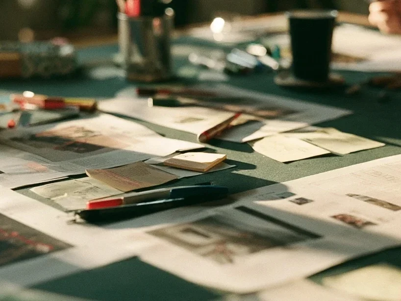
The head of brand at a time-tracking software company prints the logos from her category page on G2, cuts the names off with scissors and spreads the squares across the table at the sales kickoff. Then she asks the reps to find their own.
Most of them get there eventually, after picking up a competitor or two first. Blue square, rounded letter, a friendly little swoosh, and the same on the next square over.
That table is the state of HR tech branding in most categories. If your own sales team hesitates, a buyer comparing six vendors between back-to-back interviews has no chance.
What makes strong HR tech branding?
Strong HR tech branding starts with a clear position and a personality the buyer trusts, such as careful, warm or precise. It then turns that into a few assets you keep consistent for years, like a colour, a shape and a way of writing, so buyers can recognize you on a review grid, a conference badge or a security document before they read your name.
The logo is one of those assets. It's rarely the most important one.
Corporate blue or friendly pastel
HR tech brands sort into two piles. One pile is corporate blue and promises compliance, and the other is soft pastel with hand-drawn people and promises that work will feel nicer.
Buyers can't tell the piles apart either. Both piles are trying to look trustworthy, and they get there by looking like everyone else who is trying to look trustworthy.
A brand that looks like a payroll stub gets filed like one. That's fine for the payroll stub, which only has to be accurate, and a problem for a company that needs to be remembered between the first visit and the demo.
How do you build a brand for HR software?
HR tech brand strategy comes before any logo sketch, and the order matters more than the budget.
Settle the positioning. Who the product is for and what it replaces, as covered in our guide to HR tech positioning.
Choose a personality the buyer trusts. HR buyers handle salaries and medical leave, so careful, warm and precise usually beat playful and loud.
Write the voice. How the brand sounds on the homepage, in a security questionnaire and in a renewal email.
Pick the assets to own. One colour, one shape or pattern, one type style and one way of showing people.
Design the identity. Only now does the logo get drawn.
Brand agencies that do this well hold back the visuals until the first four steps are written down. Ask to see the written strategy behind any identity they show you, because the order of work tells you more than the portfolio does.
The visual cues HR buyers remember
Ehrenberg-Bass researcher Jenni Romaniuk measures a brand asset's fame as the share of category buyers who think of the brand when they see the asset, as she explained at Mumbrella360 in 2024. In HR tech that bar is low, because so few brands own anything a buyer could name.
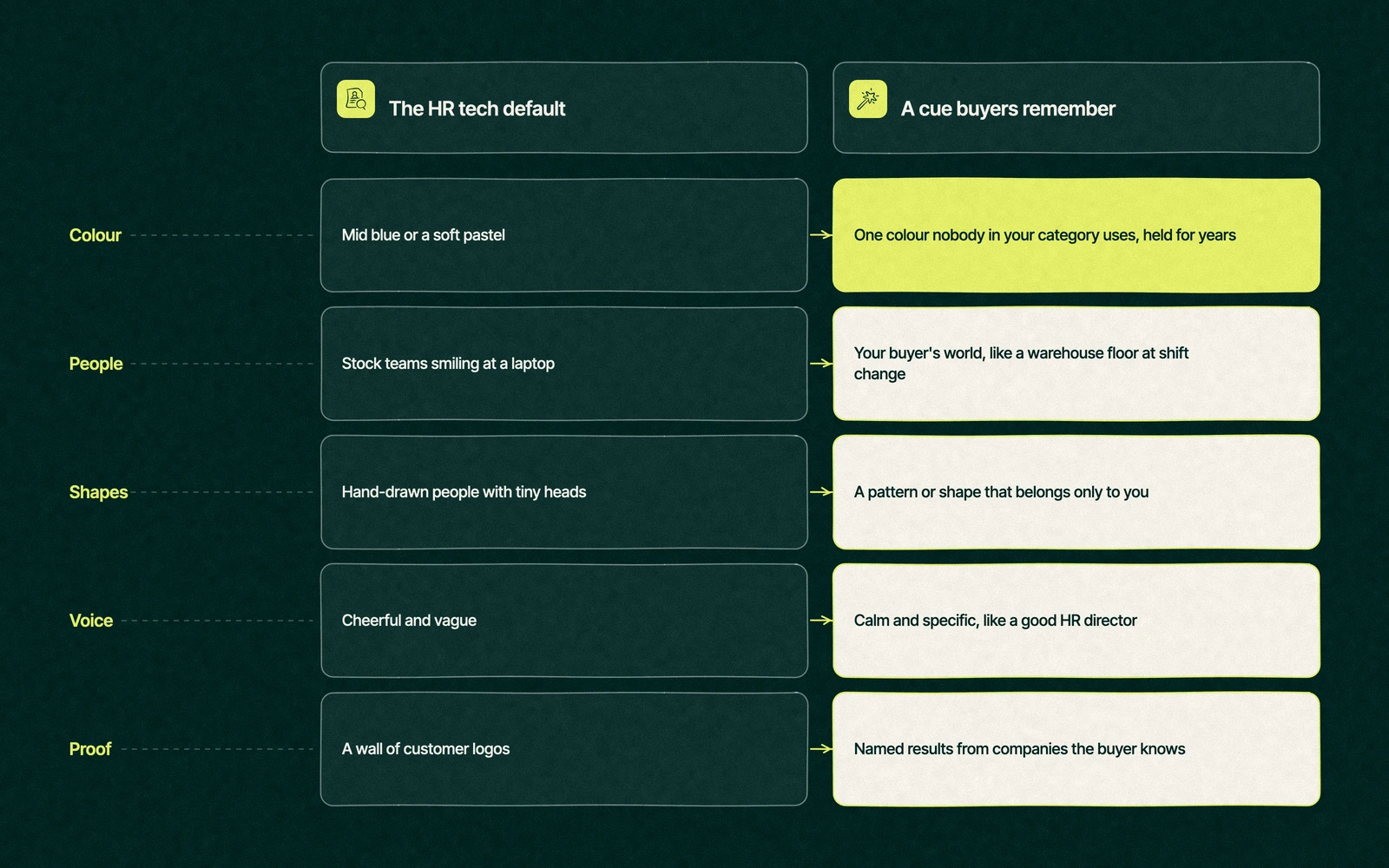
Brand element
Common HR tech default
What to do instead
Colour
Mid blue or a soft pastel
One colour no rival in your category uses, held for years
People in images
Stock teams smiling at a laptop
Your buyer's world, such as a warehouse floor at shift change or a clinic break room
Illustration
Hand-drawn people with tiny heads
A pattern or shape that belongs only to you
Voice
Cheerful and vague
Calm and specific, the way a good HR director writes
Proof
A wall of customer logos
Named results from companies the buyer recognizes
Change is what wears these assets down. Every refresh that swaps the colour or redraws the shape resets the buyer's memory to zero, so pick carefully and then leave them alone.
Trade You.
Your email for great content delivered to your inbox. Regularly. Unless we forget. Or get busy. But we'll try.
Thank you! Your submission has been received!
Oops! Something went wrong while submitting the form.
The booth with three logos
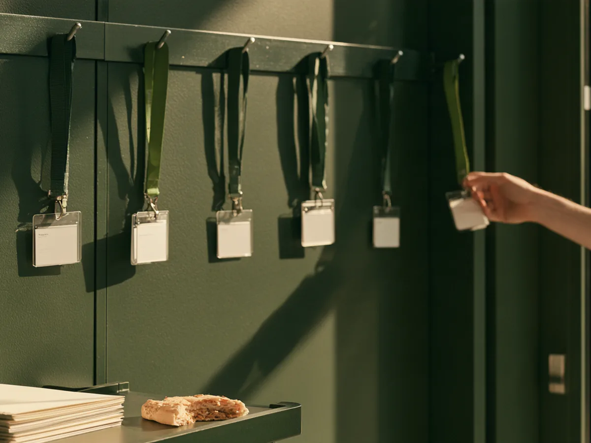
A benefits administration startup launches its new brand a month before a big HR conference such as the HR Technology Conference. The booth is a bold dark green with a new pattern, and the team looks sharp in matching shirts.
A prospect who visited the website the week before walks past twice, because the site still carries the old blue logo. Later she gets a follow-up email with a third version of the logo in the signature, and the security questionnaire arrives as a PDF with the original wordmark from the seed round.
Nobody ever lost a deal because the logo was too easy to recognize. Plenty of deals get quietly harder when the buyer has to check whether three documents came from the same company.
The brand shows up at every one of these moments in an HR software sale, and each one needs the new version on launch day.
The review site profile and its screenshots.
The conference booth, badge scanner and follow-up email.
The security questionnaire, the order form and the invoice.
The product login screen, the first thing a new customer sees every morning.
The website comes first on that list in practice, and our guide to HR software website design covers what it needs beyond a new logo.
When should an HR tech company rebrand?
Most HR software companies need a tidy-up more often than a rebrand. A rebrand that changes the logo and keeps the homepage headline is a very expensive haircut.
Signal
Rebrand
Tidy up
The positioning has changed, such as a move upmarket or a new buyer
Yes
A merger, acquisition or new name
Yes
Buyers confuse you with a competitor
Yes
The brand looks dated, but people still recognize it
Yes
Assets are inconsistent across the site, decks and product
Yes
A new executive wants a fresh look
Yes, and talk them down gently
A merger is the clearest case for HR tech branding work, since two logos can't share one sales deck for long. A dated look with strong recognition is the clearest case for leaving the assets alone and fixing the templates around them.
The brand also has to survive the trip upstairs. The CFO who signs may only ever see your order form and security PDF, so those plain documents need the same colour and voice as the booth.
Who should hold the pen
Branding for HR tech goes best when one team owns the strategy and the identity together, so the colour choices trace back to the buyer. If you're comparing an HR software branding agency with a freelance designer, ask to see the strategy document behind their last identity, and judge the thinking before the logo.
Leapyn handles brand strategy and visual identity as one project, delivered in weekly rounds so you watch the brand take shape instead of waiting for a big reveal, for a fixed project fee shown on our pricing page. Our HR tech marketing guide shows where the brand sits in the full program, and our HR tech marketing agency page shows how we work with HR software companies.
Show us a photo of your last conference booth. We'll tell you whether a buyer could name it from across the hall.Book a free strategy session and you'll leave knowing which assets to keep and which to retire.
“
The first call felt like talking to someone who already understood our business. We didn’t have to explain the basics. They showed up with questions that mattered.
James L.
Director of Growth, HR tech
Client
FAQ
Frequently asked questions
What makes strong HR tech branding?
+
Branding that works in HR tech rests on a clear position, a personality the buyer trusts and a few assets held for years. Careful, warm or precise usually suits HR buyers better than playful. Own one colour, one shape and one voice, then use them everywhere a buyer meets you, from the review site profile to the invoice and the product login screen.
How do you build a brand for HR software?
+
Brand work for HR software runs in order. Settle the positioning, choose a personality, write the voice, pick the assets you want buyers to remember, and only then design the logo and identity. Skipping straight to visuals is the most common mistake, because the designer has to guess what the brand is supposed to say and who it is for.
How much does an HR tech rebrand cost?
+
Most of the cost sits in scope. A tidy-up of colours, type and templates costs far less than new positioning, a new name and an identity applied across the website, product, decks and events. Ask for a fixed price in writing that lists every deliverable. Leapyn quotes brand projects that way, as a project fee agreed before work starts.
When should an HR tech company rebrand?
+
Rebrand when the positioning changes, after a merger or acquisition, or when buyers keep confusing you with a competitor. If the brand only looks dated but people still recognize it, tidy it up instead and keep the assets buyers already know. A new executive wanting a fresh look is a reason to talk, and rarely a reason to rebrand.
What is the difference between brand strategy and visual identity?
+
Visual identity is what people see, such as the logo, colours, type, imagery and patterns. Brand strategy is the thinking underneath, covering who the brand is for, what it stands for, its personality and its voice. Strategy should come first, because an identity designed without it tends to copy the category defaults that make HR software brands blur together.
Written by
The Leapyn team
Senior marketers who run strategy, creative and demand gen for B2B companies. We write about what’s working for our clients right now.